Brink: Trauma-Informed Copy for Later-Life Identity Discovery
Brink Study Overview
Creating psychological safety through strategic language for adults 30+ navigating LGBTQ+ identity
The Challenge
How do you craft copy for a coming-out app that supports identity exploration without being patronizing or overly promotional? The messaging needed to create safety, empower users, and meet them with genuine care in a digital space that may have previously felt unsafe.
My Role
UX Copywriter, Content Strategist, Accessibility Advocate, Visual Mockup DesignerI wrote trauma-informed copy across 15 mobile screens, treating every word as part of the user experience.
I also designed the layout for each screen, utilizing thoughtful spacing, hierarchy, and visual pacing to minimize emotional friction and enhance clarity.
Each phrase and placement was tested against three core principles:
Does this create safety?
Does it honor autonomy?
Does it invite instead of assume?
Key Strategic Decisions
“Late Bloomers” vs. “Older LGBTQ+ Adults” Celebrates identity instead of labeling it
“Your Toolkit” Framing — Centers agency over diagnosis
Permission-Giving Phrases — “when you’re ready,” “on your terms,” “whatever that looks like for you”
Accessibility-First Structure — Copy reduces emotional and cognitive load throughout the experience
Page Structure & Visual Strategy
The layouts were designed to mirror the emotional rhythm of a ritual: slow openings, steady engagement, and a spacious return.Every design element, from white space to section pacing, reinforces the brand’s invitation to prioritize care over hustle for results.
Product Pages Follow a calm arc of intention → engagement → integration
Journal and About Pages Blend storytelling and space for reflection
Visual Hierarchy Prioritizes emotional clarity and ease of navigation
Project Scope
15-screen mobile prototype with trauma-informed tone throughout
Onboarding flows and microcopy are designed for emotional safety
Therapist finder, event listings, private journaling, and story-building tools
Custom tone guidelines for long-term messaging alignment
Full-screen layout and mobile design mockups created in Canva
The Result
Messaging that transforms a tool into a trusted companion.
Users reported feeling “genuinely seen and supported,” the difference between clinical distance and an affirming connection.
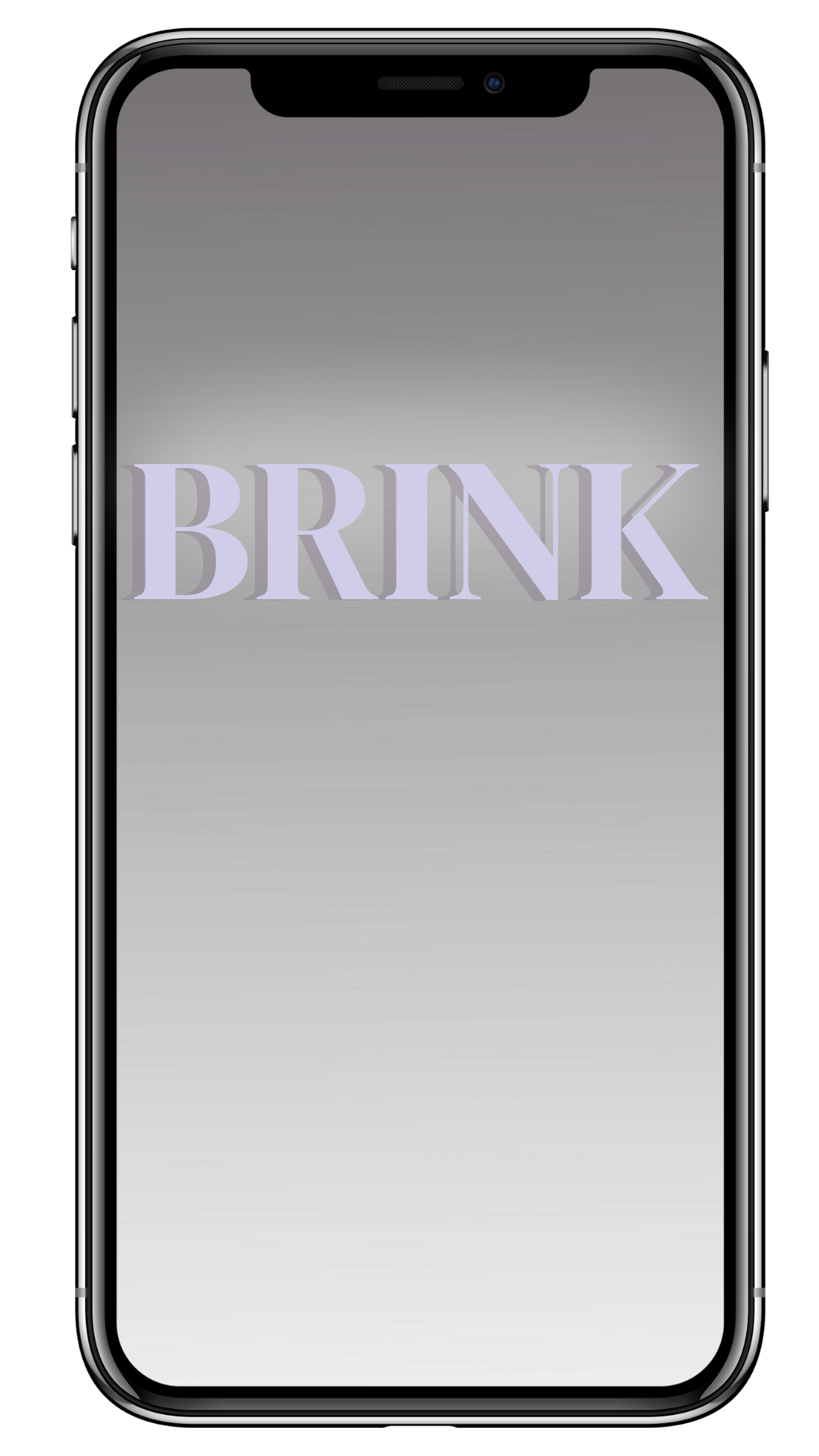
Intro Screen:Establishes a quiet, grounded tone from the start. Invites reflection, not performance.
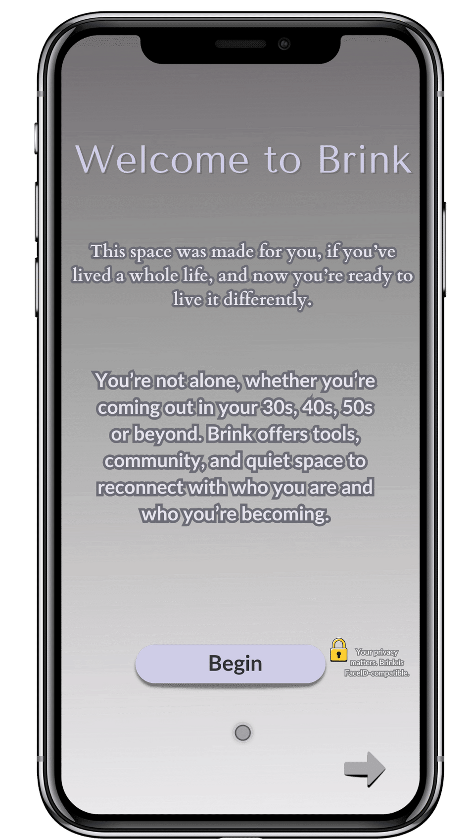
Welcome Screen:Gentle, affirming language signals safety and openness from the very first tap.
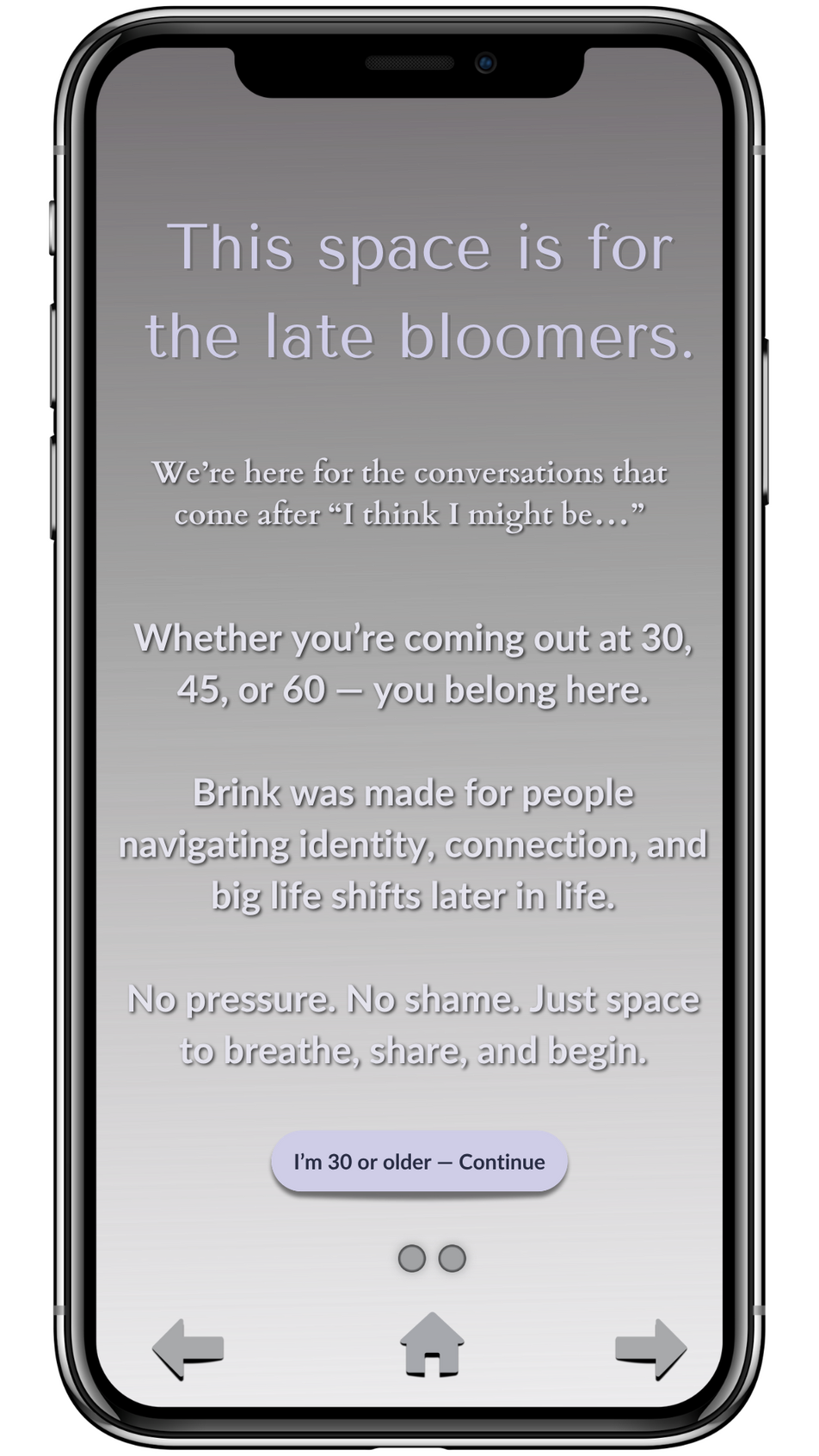
“Late Bloomers” Message:Normalizes later-in-life identity journeys. Centers community without shame or timeline.
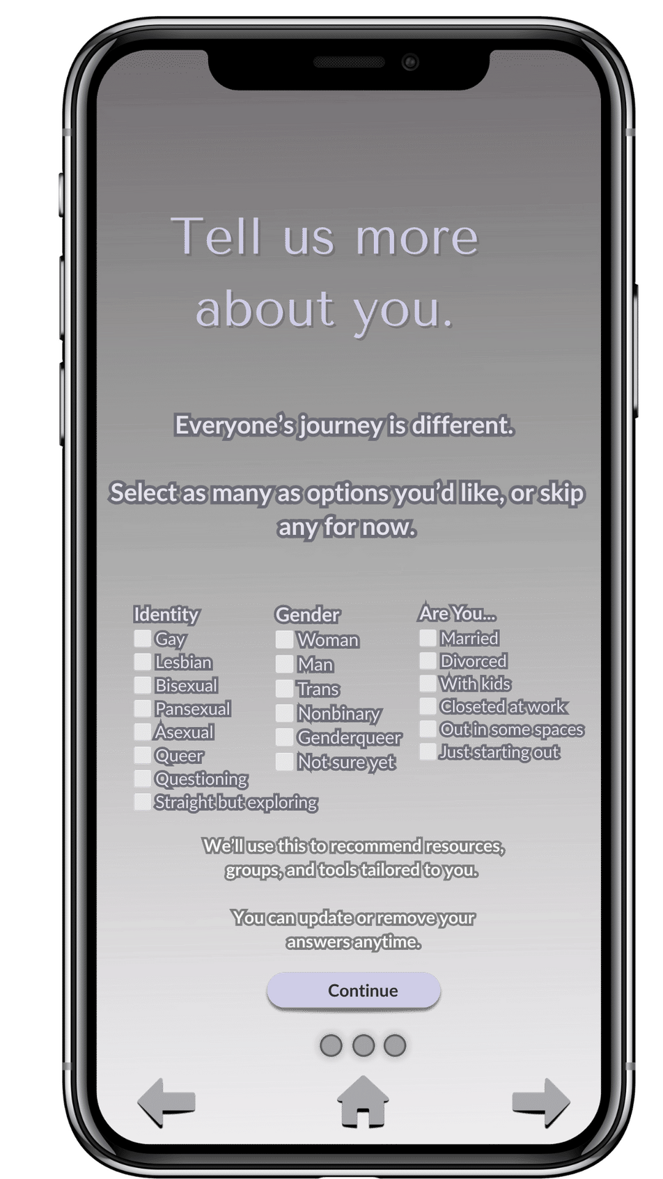
Personalization Screen:Language avoids assumptions while gently prompting self-reflection.
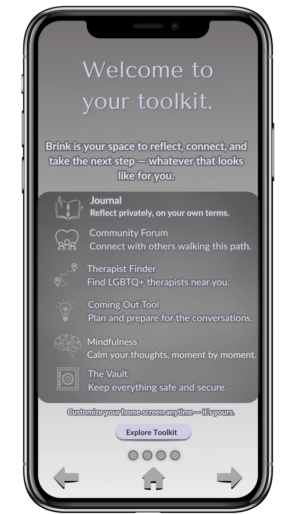
Toolkit Overview:Frames tools as invitations, not prescriptions. Centers autonomy and personal pacing.
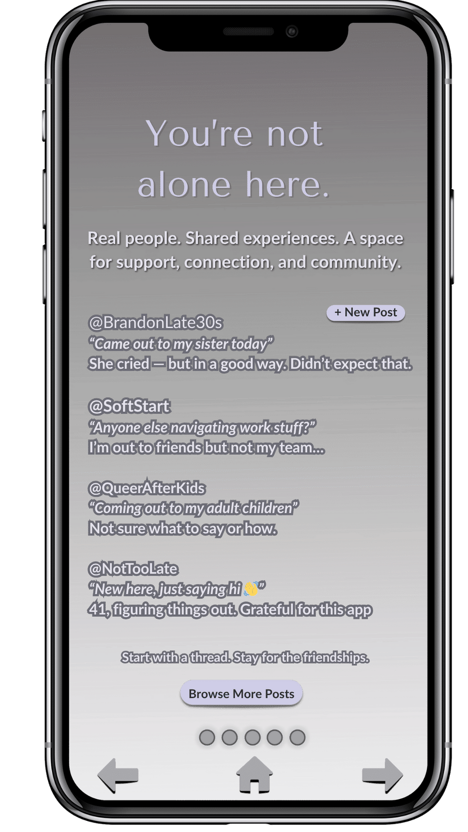
Community Grounding:“You’re not alone here” reminds users this is a shared journey. Affirms belonging before features.
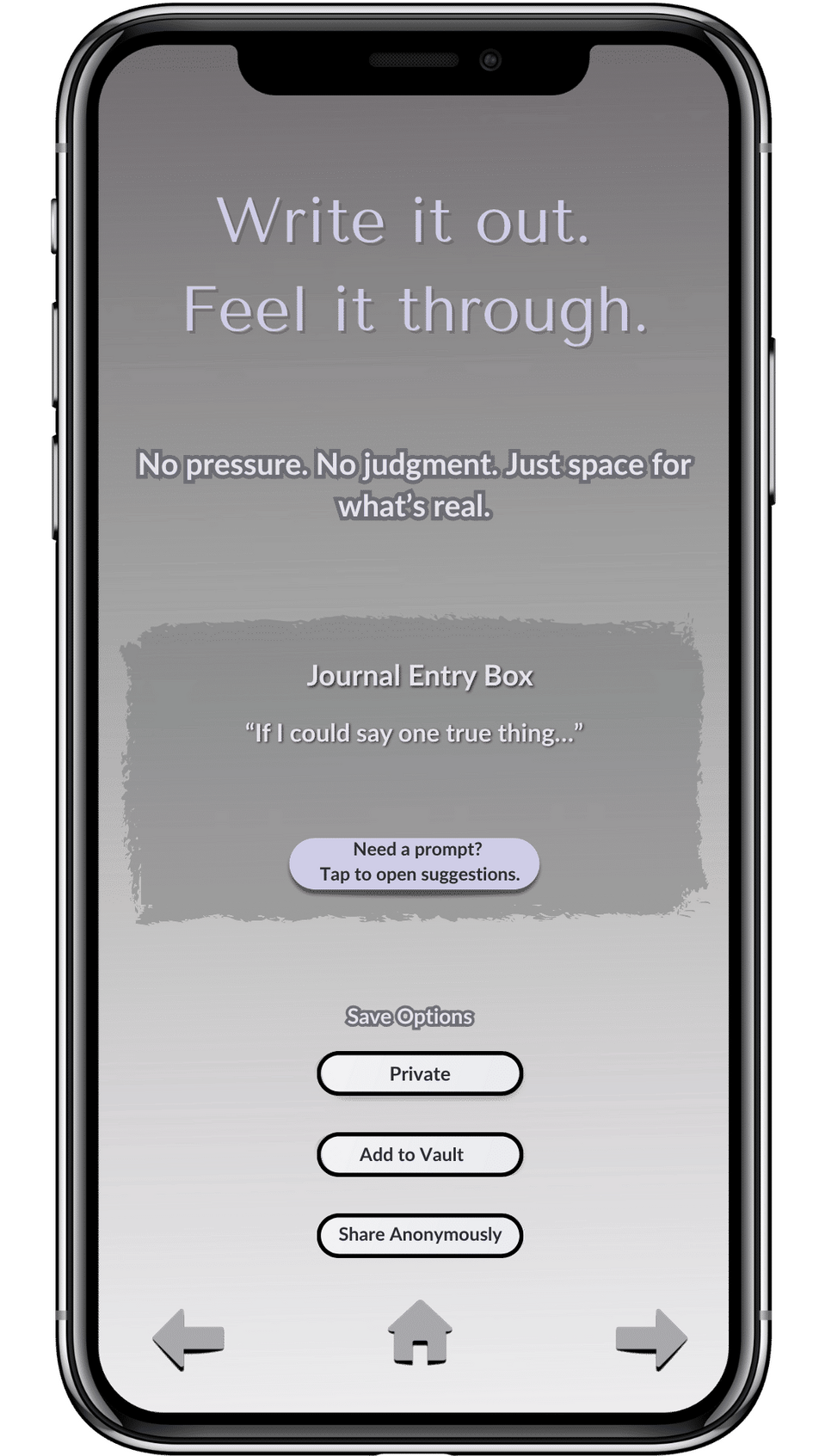
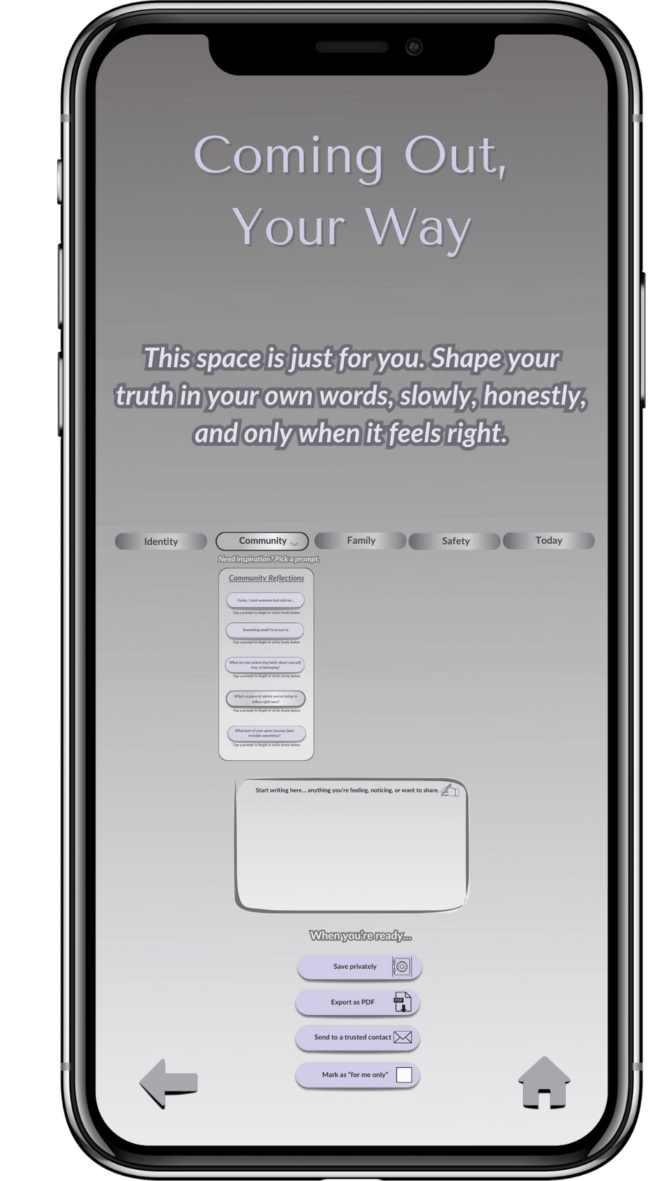
Reflection Prompts:Encourages intentional expression. Options to share, save, or keep private reinforce emotional safety.
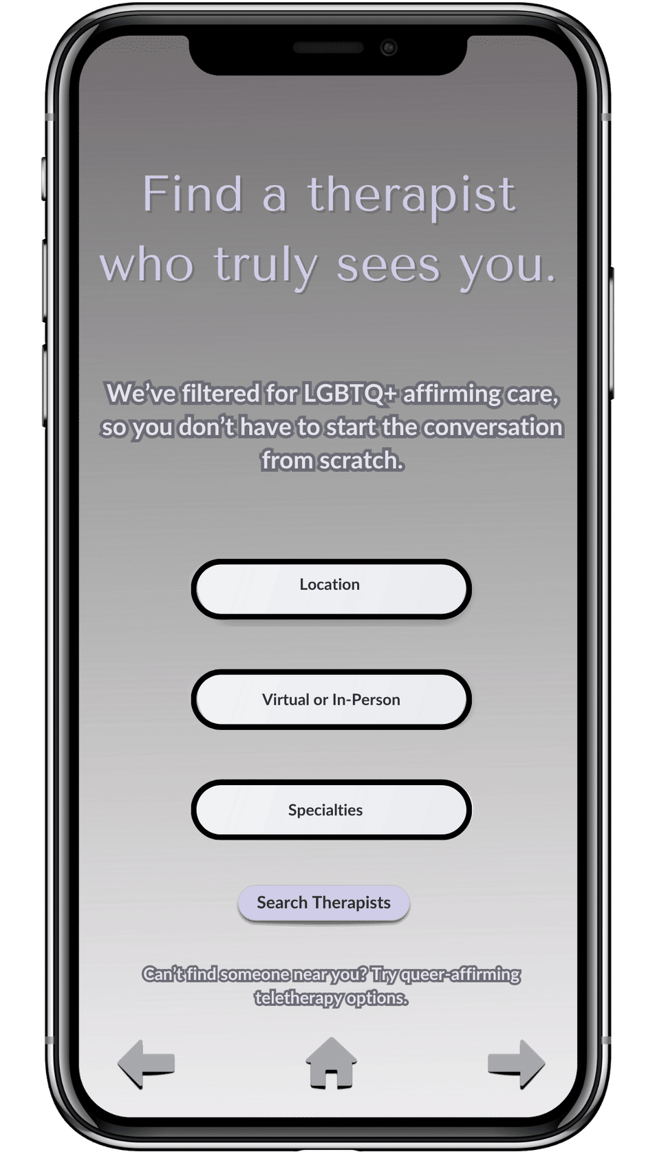
Therapist Finder:Copy balances empowerment and discretion. Reduces overwhelm and builds trust in the process.
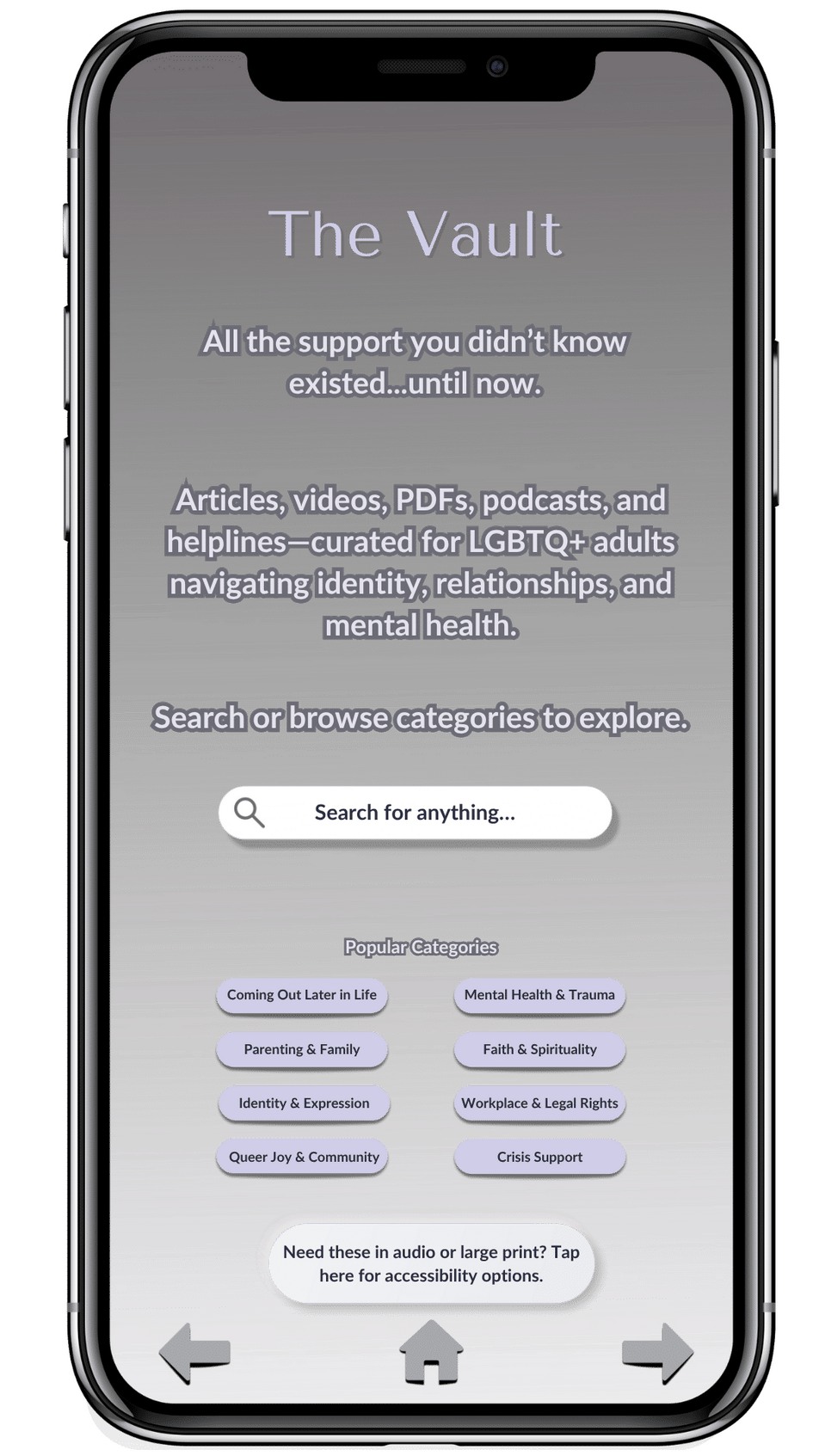
The Vault:Offers curated resources for self-guided exploration. Design minimizes cognitive load while maintaining breadth.
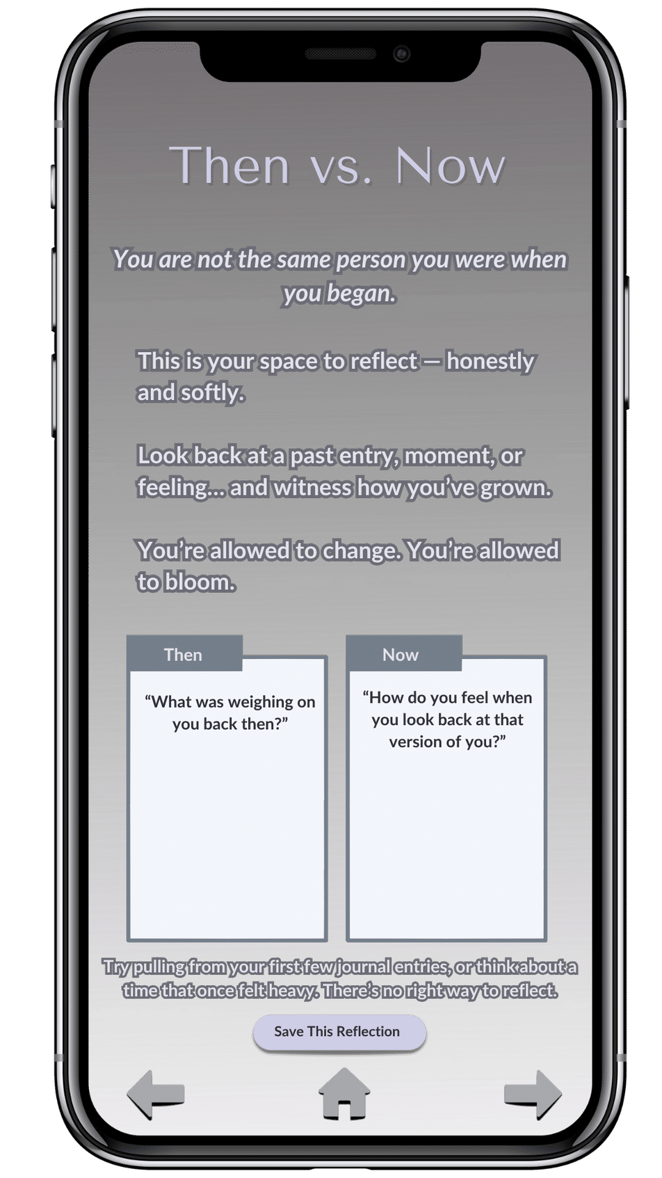
Reflection Tool:“Then vs. Now” prompt supports identity integration. Copy invites gentle comparison, not pressure to progress.
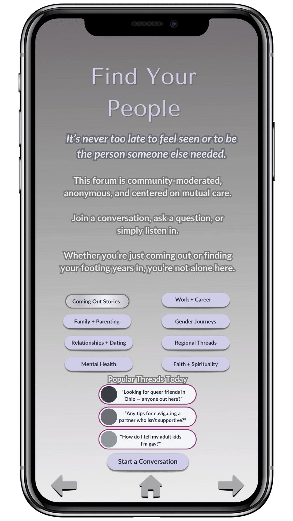
Find Your People:Soft, non-pushy invitation to explore community connections. Choice remains with the user.
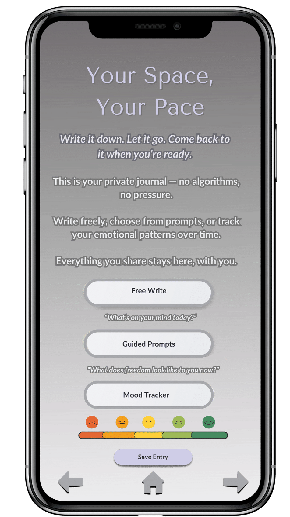
Journaling Dashboard:A private, flexible space with options for mood tracking and guided or free writing.
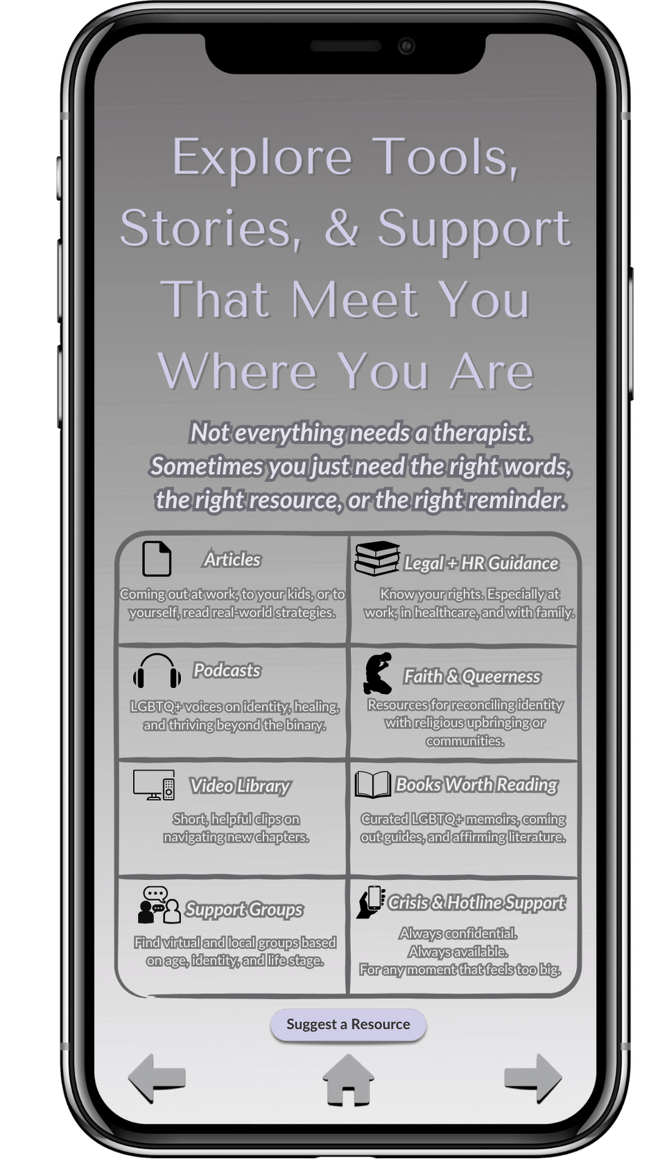
Explore Tools & Support:A gentle next step screen that keeps discovery open-ended and user-directed.
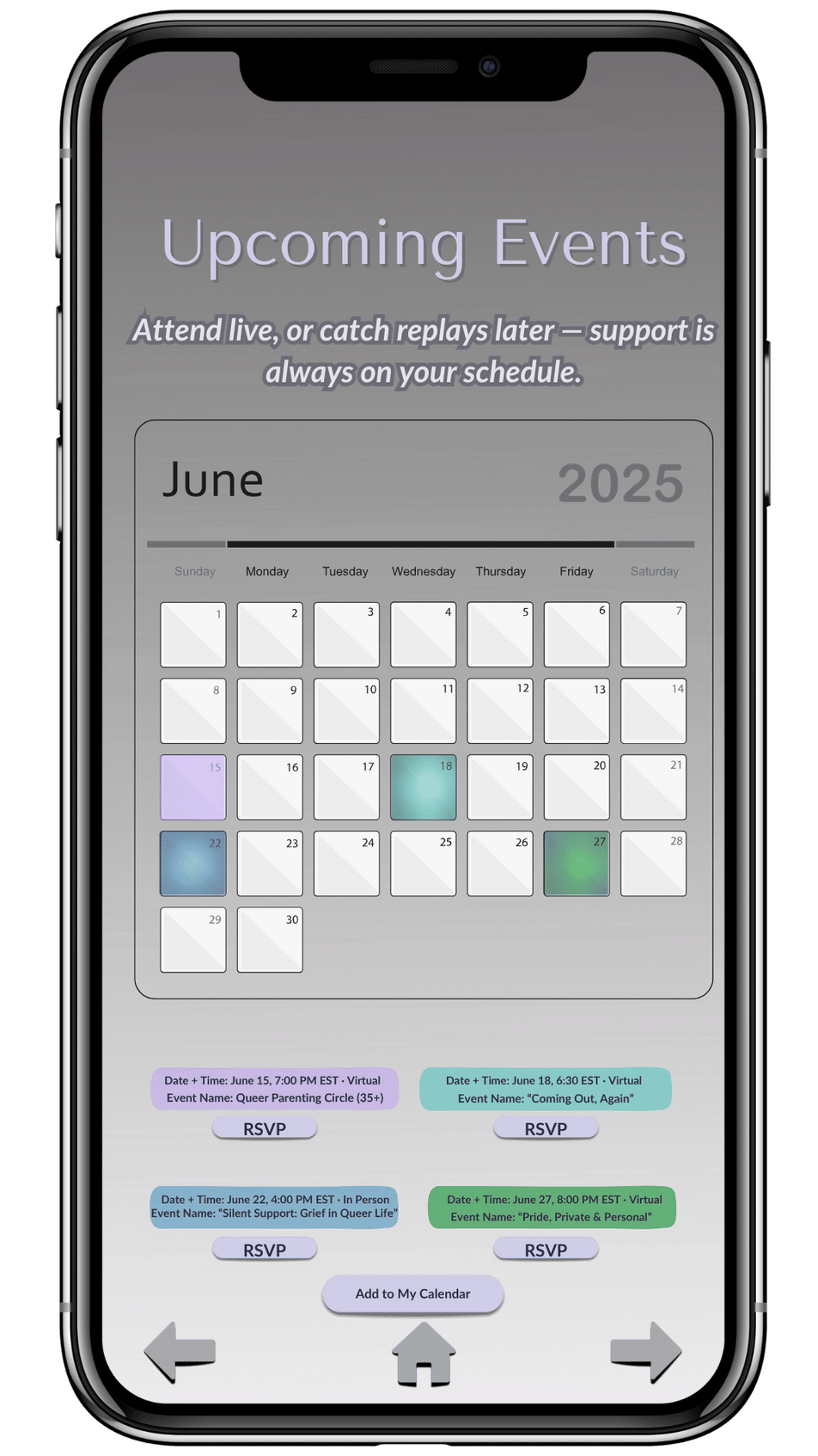
Upcoming Events:Community-building without obligation. Calendar format lets users choose connection on their own terms.
Closing Journal Prompt:Reinforces return-to-self theme. Copy encourages spacious, cyclical reflection rather than linear goals.
© Ink & Impact. All rights reserved.